XCloud

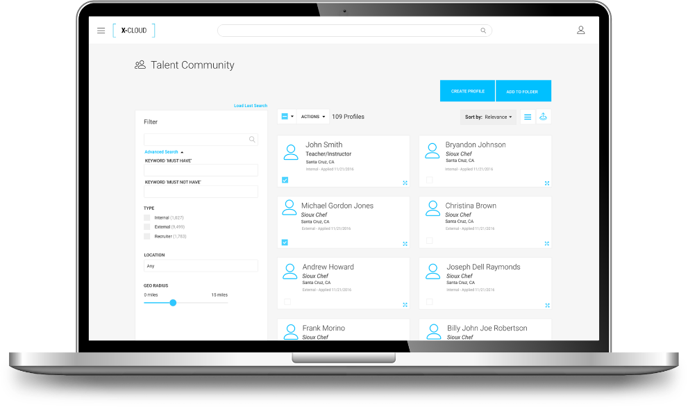
A start up from the ashes of Findly. XCloud was a CRM Talent Network for enterprise solutions focusing on a seamless experience for recruiters. This was the beginning effort from the ground up for a much larger platform, with multiple applications tied to each other for a cohesive experience.

  • Role: Sr. UX Designer/Manager
  • Project: Enterprise SaaS Platform - ATS/CRM/Analytics
  • Year: 2016 – 2021

Product Overview

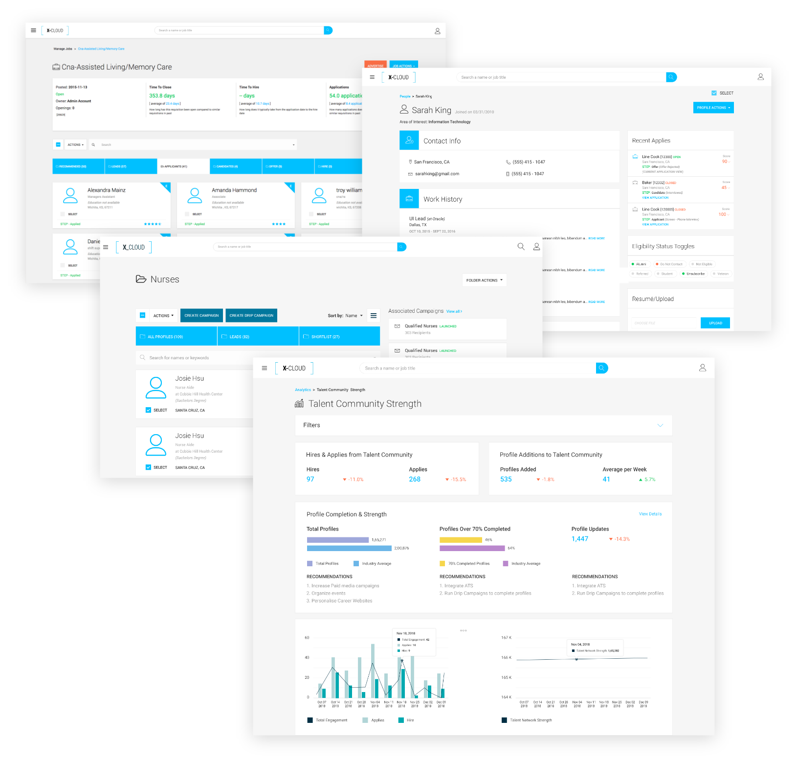
A comprehensive enterprise platform for Recruitment Marketing, integrating ATS, CRM, and advanced analytics to optimize talent acquisition strategies. Powered by data-driven insights, it supports end-to-end hiring efforts, enabling companies to identify, engage, and nurture the right talent effectively. The platform accelerates business growth by expanding networks and streamlining operations through robust automation capabilities. Key features like Campaign Marketing and Smart Folders empower recruiters, sourcers, and talent marketers with cutting-edge tools for automated workflows and holistic recruitment solutions.

My Role

I led a small design team and worked across the board with product owners, developers, designers and stake-holders to develop User interface design, Interaction flows and UX deliverables.

Manage Team
UX
Visual Design

Information Architecture

I worked with product owners and stake holders to develop the architecture for the platform.

Developing Look & Feel

In the beginning this product was a race to market. We were drinking from a firehose most of the time, and we had a lot of challenges. However, we needed to come up with a look and feel for the product, so we started coming up with visual ideas. Once branding was completed, we had some idea of where we were going and what we needed to do. Some ideas through creativity, and understanding of the users, (very little at this point) would dictate direction for this part of the project.

We went through several iterations and concepts for this process and presented ideas to leadership.

Design & UI

One of the issues that we had with the color, was the fact that the original branding color palette didn't lend itself to good UI experience for what we were trying to do. Very bright colors, somewhat difficult on the eyes and difficult to prove functional. So we had to step back and use a variant of depth from the original branding. Something that was less aggressive and a bit more comfortable for viewing.

Original Color Palette

UX & Discovery

Our Primary Users

At this point in the process in product development, our focus was on the the primary use case of the Recruiter (specifically for ATS). Following the E2E hiring cycle or application process. With the support of the CRM, which would make the primary user - but not limited to, the 'Sourcer'.

Sourcer

Sourcers are the ones that keep the pipelines filled with specific talent - usually for recurring roles or positions their organization have.

recruiter
Recruiter

Recruiters are the ones that follow the hiring process and specific candidate selection, once they’ve entered the E2E hiring cycle.

Proof of Concept & Early Testing

Once we had an early version of the product it was time to test it out on a few clients/users We started doing testing by taking it to current users of the system to gain insight and to learn about pain points, frustrations and overall issues they might have throughout the application and to also learn about what did work in the application as well.

We also wanted to find out more about HOW they were using the system, instead of only learning about pain points. So we tried to gain as much knowledge as we could about their goals, daily tasks and a bit about their mental approach to not only their work, but also their job role.

ATS

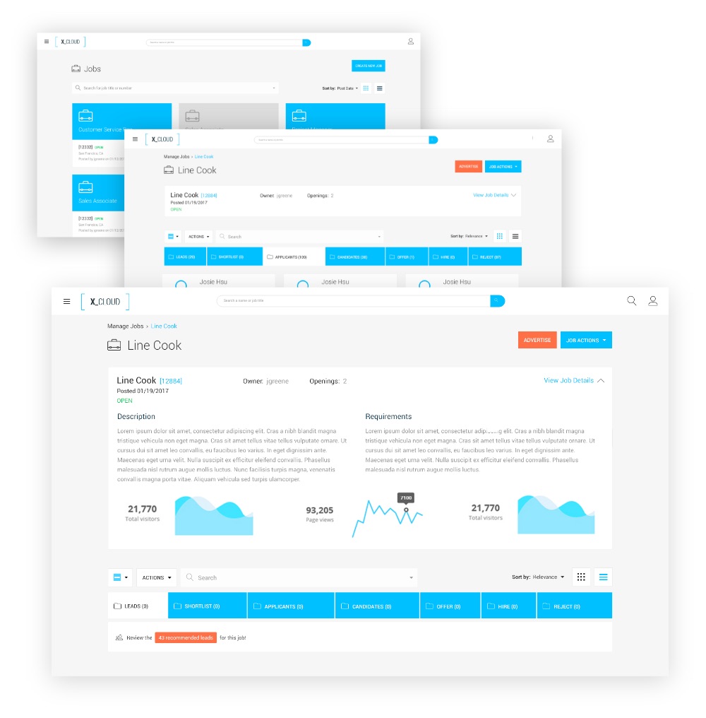
What we discovered throughout testing these designs, were more issues of features that we didn’t have at the time. We found that the usability flow worked well, however when it came time for some simple things in the test, we were lacking a bit when it came to info. The job description was important for ‘recruiters’ as they reviewed specific candidates. This was important as a reference tool for matching the right candidates with specific skills to the right positions. Also, we found that there needed to be a more rapid way of reviewing candidates, but only in the early stages, for the ‘recruiters’ to gain acceptance from the Hiring Manager.

Here you can see we hid the information, but making it easy accessible at the top of the page for easy reference when matching skills of candidates. Realestate was becoming an issue so we needed to be able to give it priority but also giving it a 'home' if you will, for easy viewing and accessibility.

CRM

What we discovered specifically for the CRM is was that the majority of the time spent for recruiters was different than the time spent for ‘Sourcers’ -

Recruiters spent much more time within the ATS following the E2E application process and the Sourcers spent the majority of their time filling pipelines and aggressively searching for talent within the CRM-

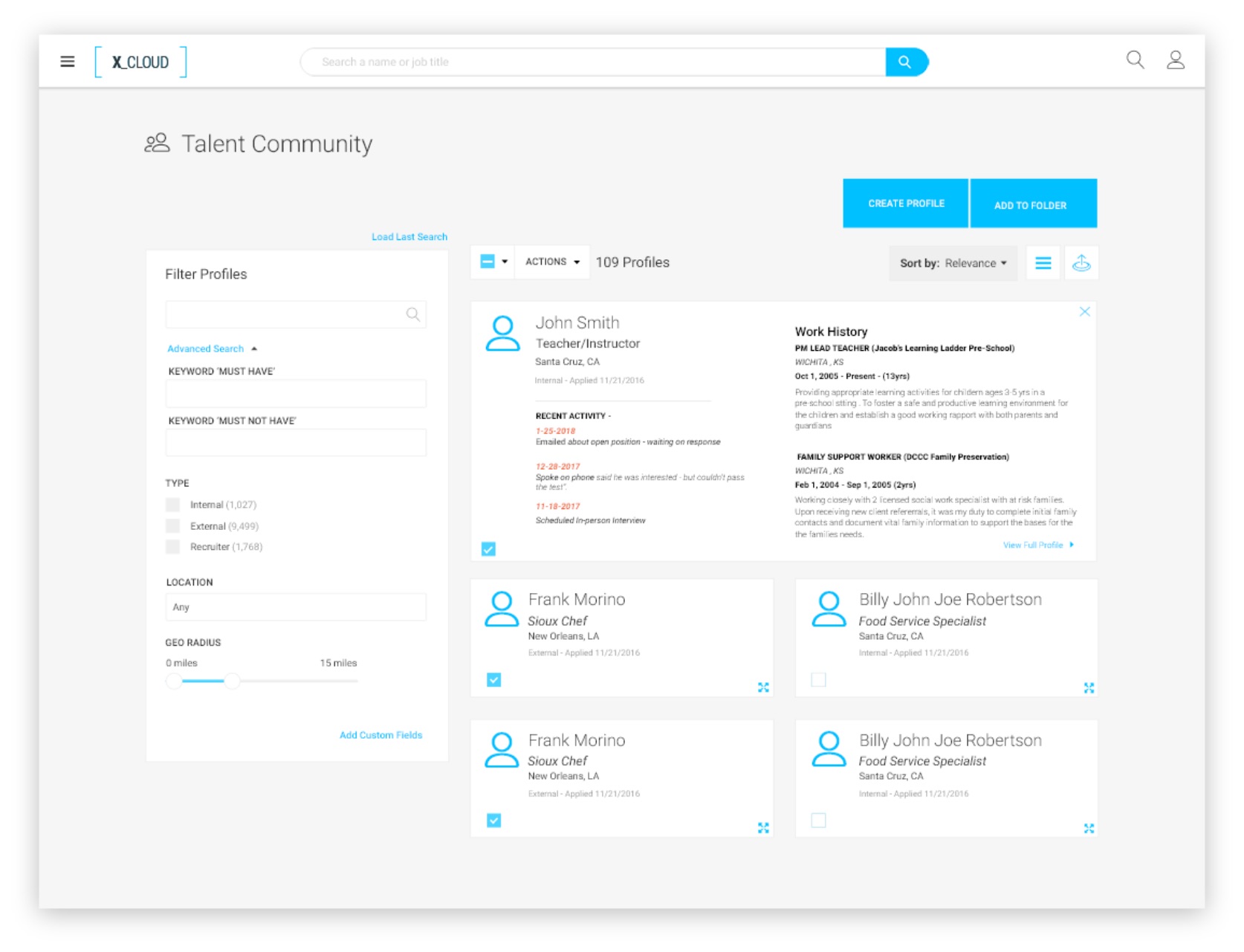
One of the issues or concerns that came up in these early stages was the fact they there wasn’t enough information on a card to let the user make a decision to either move forward with that candidate or move on to the next. Which prompted the question: what IS the right information or data to give the user enough to make a decision? We found through research that if was different for everyone. What they needed was some kind of summary or ‘quick-view’ effect to let the user know what they need to make a decision.

Solution

One solution was to create an interaction for the user to have a “quick view” option. This would address the issue for lack of information, or the ability to view different information to make an effective decision on each specific candidate. This would also have an ‘Admin’ section, for specific information as it relates to chosen data points, giving customized flexibility to organizations as it fits their needs.

Automation

Smart Folders

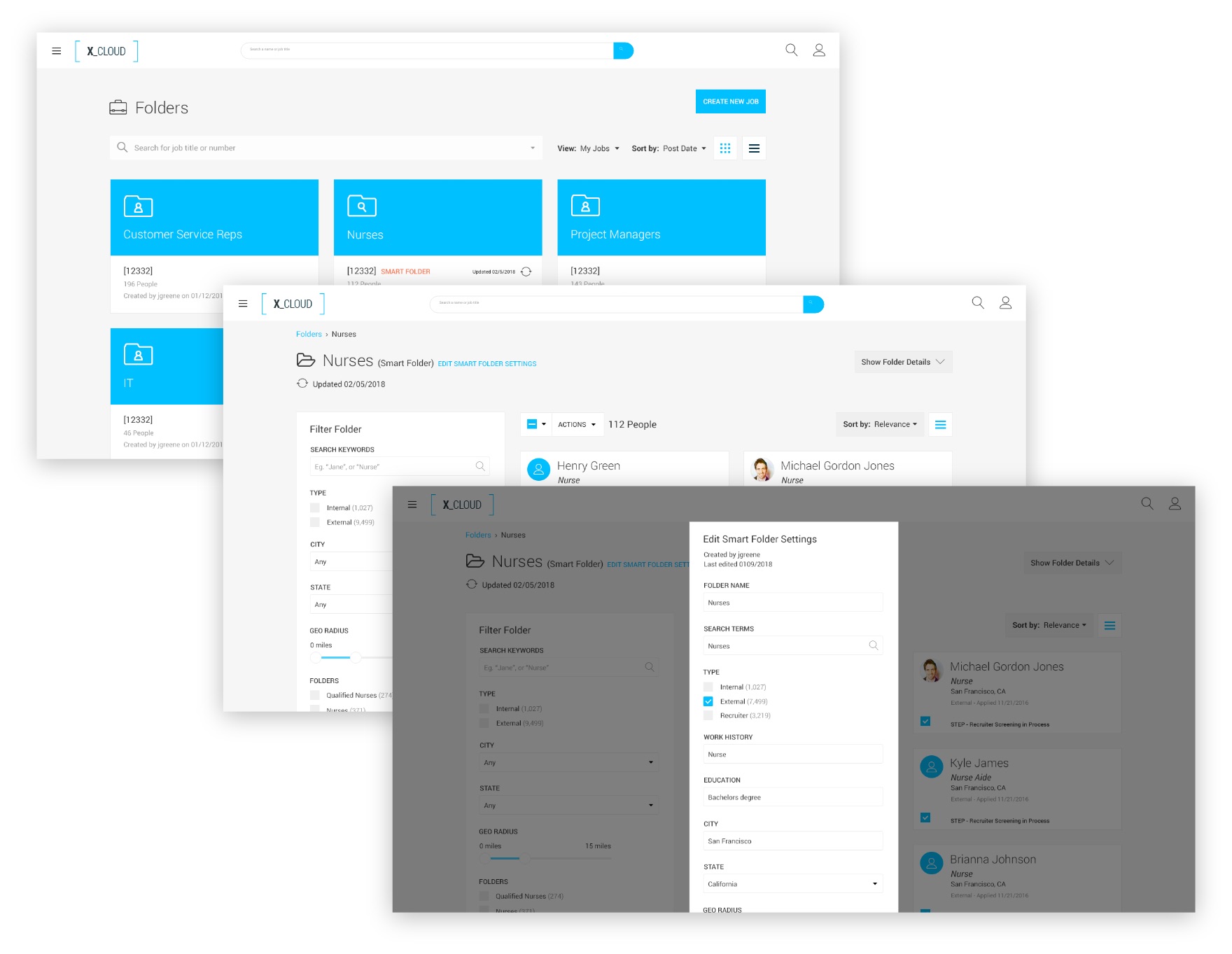
The concept of ‘Smart Folders’ was to take the burden away from the user, the hassle of reviewing new candidates that come into the system, by automatically capturing the candidates information and sending them to a specific group/folder of candidates, based on a specific criteria, set by the user.

Summary

We achieved a lot in a short amount of time. We delivered an enterprise platform in less than a year starting from the ground up. Working with a skeleton crew, learning as we go, we put a competing product on the market within a year.


Biggest Learning Experience

Having to Learn the landscape of Recruitment Marketing.
Trying to understand the mental approach to the product(s).


Biggest Challenges

Designing with limited access to users, and relying on product for direction.
Time.


What I would’ve done different

More upfront Research to understand user behavior and pain points.
More user testing on specific features.