BTP Underwriting
![]() When: 2023-2024
When: 2023-2024
![]() Team:Design Mgr, 2 Designers (1 Prototyper 🤓)
Team:Design Mgr, 2 Designers (1 Prototyper 🤓)
![]() My Role: Sr. Product Designer - (prototyping)
My Role: Sr. Product Designer - (prototyping)
![]() Tools: Figma
Tools: Figma
![]() When: 2023-2024
When: 2023-2024
![]() Team:Design Mgr, 2 Designers (1 Prototyper 🤓)
Team:Design Mgr, 2 Designers (1 Prototyper 🤓)
![]() My Role: Sr. Product Designer - (prototyping)
My Role: Sr. Product Designer - (prototyping)
![]() Tools: Figma
Tools: Figma
Underwriting is the process of evaluating, assessing, and assuming risk in financial or insurance transactions. It involves determining whether a particular application or transaction is acceptable based on certain criteria, and if so, under what terms and conditions. This process is critical in industries like insurance, banking, and securities.
A new Business Technology Platform (BTP) product for underwriting was needed to create a new workspace within the platform and update the existing product currently in use.
I contributed by prototyping interactive screens to help engineering assess feasibility, provide product owners with tangible designs, and gather feedback from a small focus group of users, ensuring the solution addressed key challenges effectively.
For prototyping, I leveraged Figma's new "variables" features to enhance interactivity and realism, utilizing Boolean variables for toggling states and String variables for dynamic text inputs.

As part of the design system team, I was responsible for building and maintaining Figma components, ensuring they aligned with the current branding and design needs of products in production. This involved:
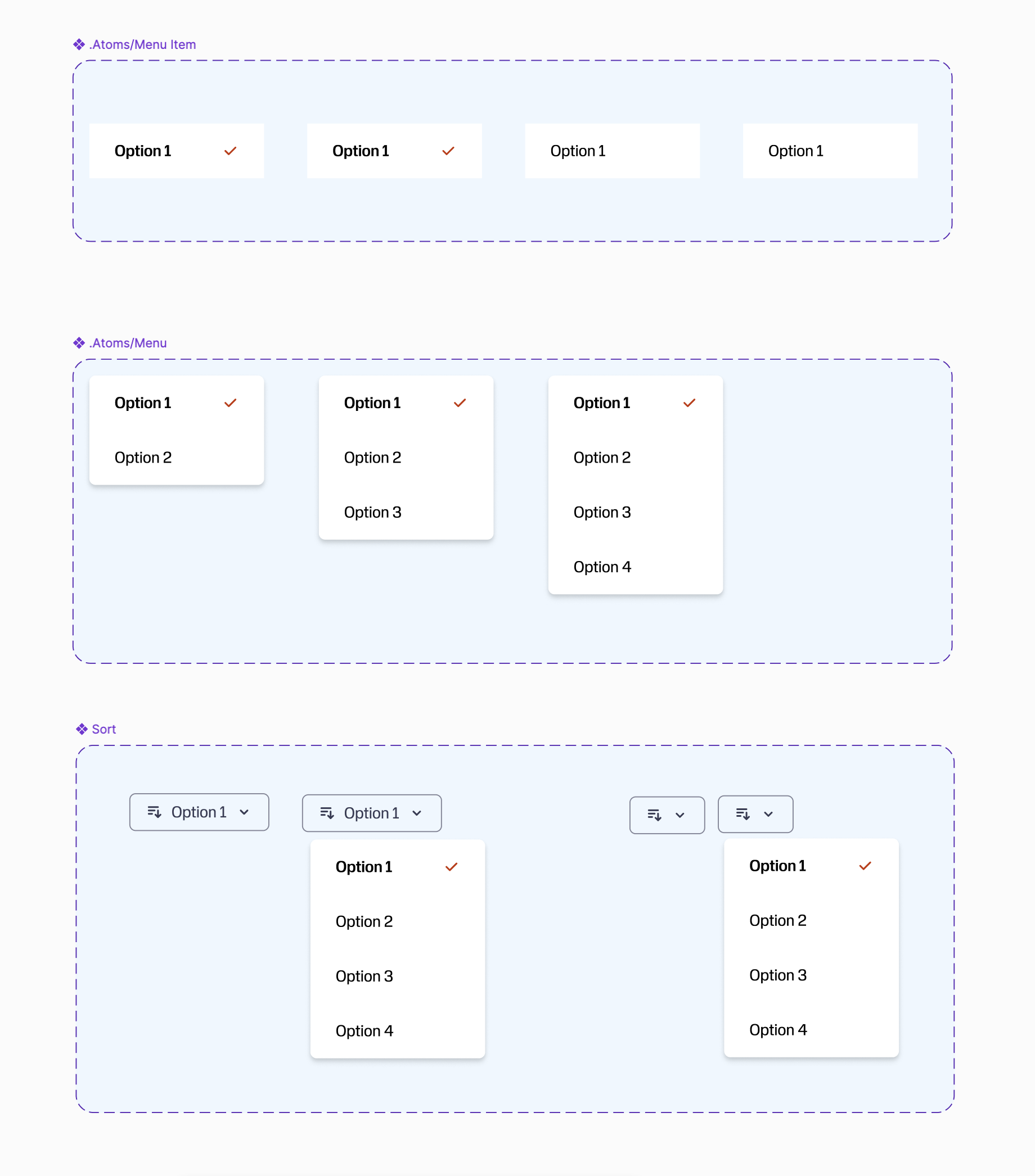
Purpose & Use
Sort components let users organize data by criteria like alphabetical order, price, or date, offering quick control over how information is displayed without needing to refresh or navigate away.
Sort components can greatly enhance usability by giving users control over their data, but they can backfire if options are unclear or misused. Stick to logical defaults, and always keep the user informed about what’s happening.
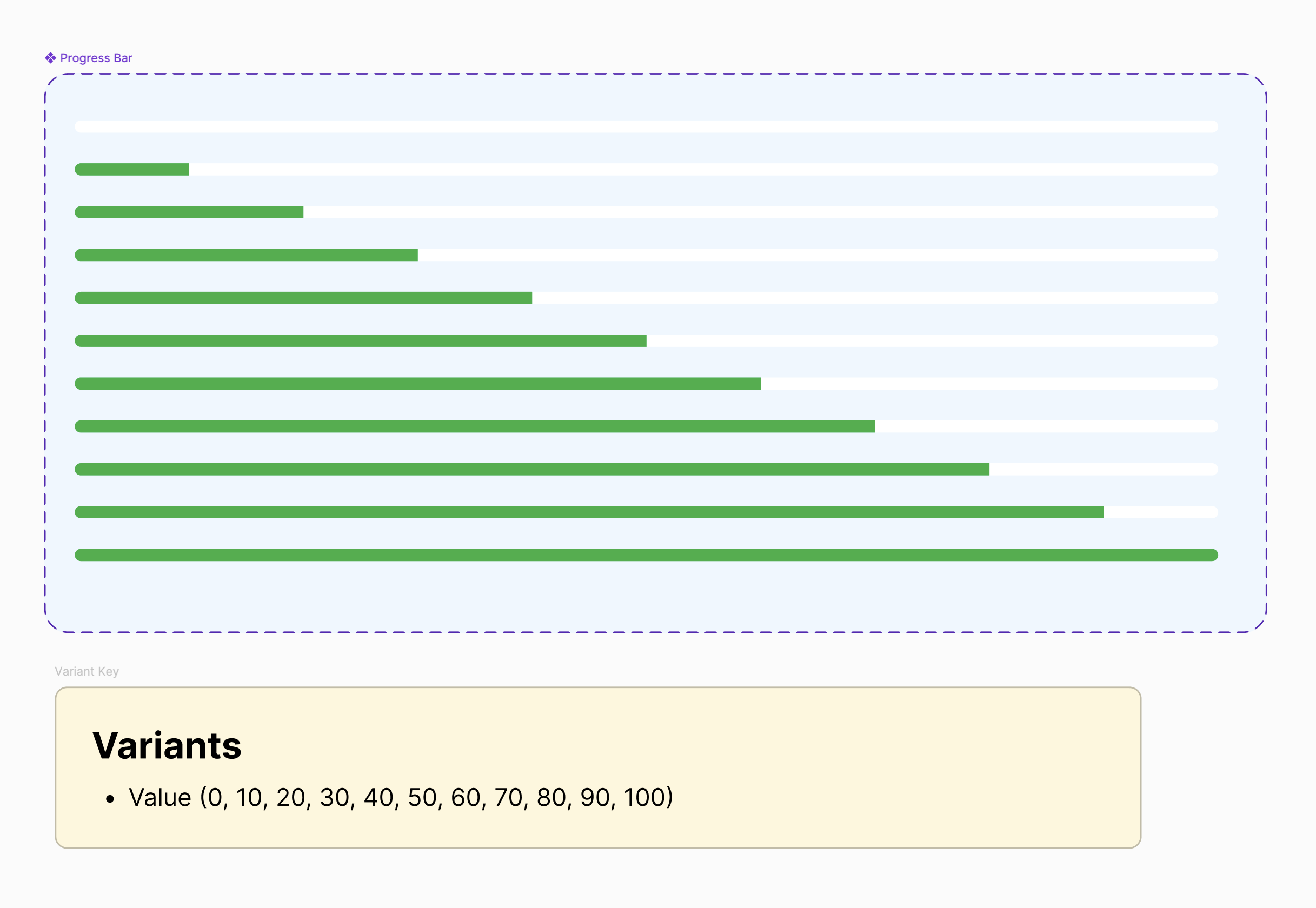
Purpose & Use
Progress bars display the completion percentage of a task, offering a visual representation of how long the task will take. They are ideal for tasks with a predictable duration, like file uploads, downloads, or multi-step forms.
Progress bars help manage expectations by showing real progress, but they must be accurate and informative to avoid frustration. Use them only when task duration is predictable.
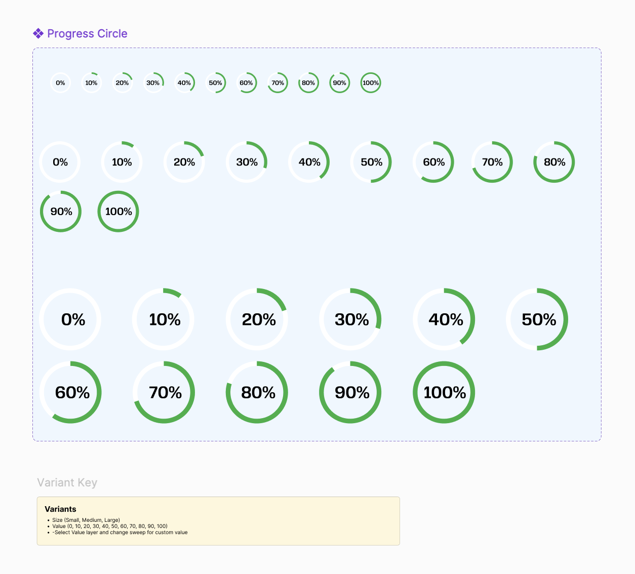
Purpose & Use
Progress circles visually represent task completion as a percentage, often used in places where space is limited. They work well for tracking goals, uploads, or system statuses in a more compact format than traditional progress bars.
Progress circles are a great way to display progress in a compact and visually appealing way, but they should be used when space is limited and the progress percentage remains clear.
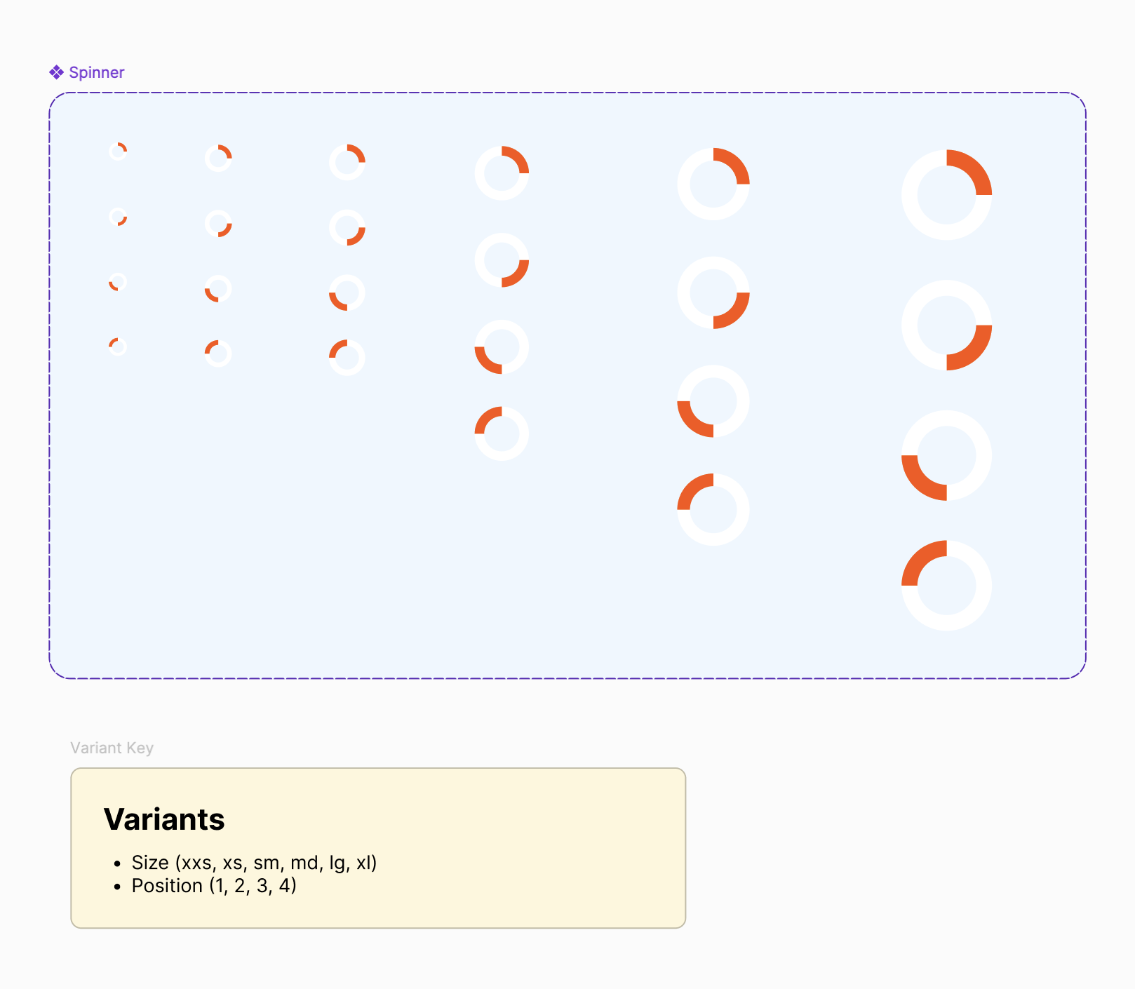
Purpose & Use
Spinners indicate that a system is working on a task without a known duration, such as loading search results, submitting a form, or processing data. They reassure users that something is happening without providing a specific time estimate..
Spinners are useful for short wait times but can be frustrating if misused. Keep them visible, contextual, and non-blocking—when in doubt, consider a progress bar instead.
A well-designed component library enhances consistency, usability, and efficiency across a product's UI. By following best practices for each component—whether it's a spinner, progress indicator, or sorting control—you create intuitive experiences that keep users informed and engaged. Prioritize clarity, accessibility, and responsiveness to ensure seamless interactions across all touchpoints.