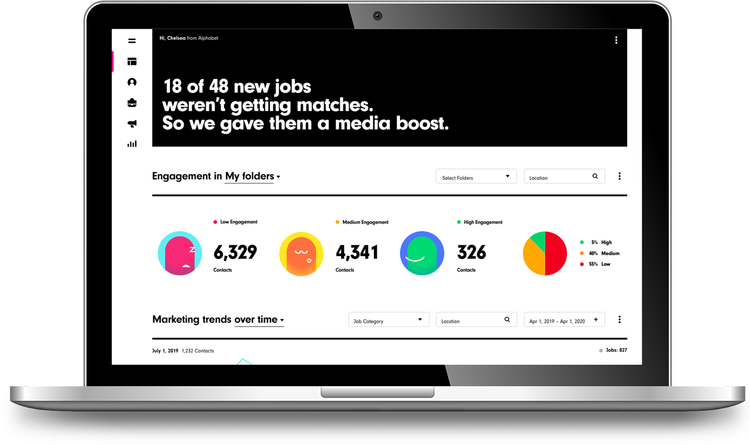
SFX (Smashfly-X) was an effort to combine 2 platforms into a seamless experience. SFX is an enterprise solution platform for recruitment marketing. After our company (Symphony Talent) acquired Smashfly - The focus was to bring together the 2 products into one, Our goal was to build a cohesive experience from both platforms - rethinking the new products design, features and UI/Look and Feel.
My job as the UX Designer involved developing user flows for product features, IaX design, making sure the usability wasn’t difficult and making the journey for a feature simple and intuitive. I also conducted user-research, contextual interviews and user testing.

When we started to dig in to execute on the new platform, we needed to understand who would be using the platform - for the most part since it was a recruitment marketing tool, we had a good idea as to who the users were, however we needed to understand them better. In relation to a piece of software - their goals, objectives, mental approach - (to the product), how they measure success, and also in comparison find out more about their jobs, the things they do day in day out, and how these everyday actions can be applied to the usability of the new product/platform. We spoke with 20 individuals and developed 3 role based archetypes.

Specializes in identifying and engaging passive and active candidates to build talent pipelines.
The Sourcers role in recruitment marketing focuses on identifying, attracting, and engaging top talent to build robust candidate pipelines. Sourcers are skilled at leveraging various tools and strategies to connect with passive candidates and ensure a steady flow of potential hires for current and future roles.
Engagement Level - High
Feature Utilization - High

Manages the entire recruitment lifecycle, from screening to onboarding.
The Recruiter role in recruitment marketing integrates traditional recruitment responsibilities with marketing strategies to attract top talent and enhance the employer brand. Recruiters focus on promoting the organization as an employer of choice while managing the hiring process to deliver a seamless candidate experience.
Engagement Level - Medium
Feature Utilization - Low

Finding passive candidates building pipeline of resources for future needs
The Talent Marketer is finely attuned to brand perception, ensuring the company’s employer brand resonates with top-tier candidates. Through multi-channel recruitment marketing—spanning digital, social media, and targeted outreach.
Engagement Level - High
Feature Utilization - High
Search is probably the most important tool for users as they engage with the product. It’s usually the first thing accessed and graded by how well the tool delivers results. When the product team learned that specific clients “could” use up to 30 ‘filters’ for searching across the CRM - we had to figure out a way to design, not only an intuitive solution, but also an effective one. We didn’t want the UI to be all ‘Filtering’ options blocking a view of results after a search had been executed. However we didn’t want to take that ‘access’ to additional options for the tool away, either. Since we were acquiring users from a legacy platform we wanted to see how these subjects were using that system, comparing it the existing platform to build a new and better platform. Not only did we have a lot of questions about ‘filtering’ but also about how they used Search in general.
When combining two platforms - migration/adoption can be an issue for users - however we wanted to make a better or more improved platform for both our new and existing users.
First we started recruiting users from existing clients - and screening through questionnaire/Survey we built when we scheduled them. This told us their primary use of search and search habits... What they used it for, and how often.
Once we gathered all the results from the questionnaire/survey, we did 1:1 contextual interviews - having the users complete specific tasks - walking us through exactly how they executed a search while we viewed them in real-time.
Since we were acquiring users from a legacy platform we wanted to see how these subjects were using that system, comparing it the existing platform to build a new and better platform. Not only did we have a lot of questions about ‘filtering’ but also about how they used Search in general. So we wanted to talk to a few users.
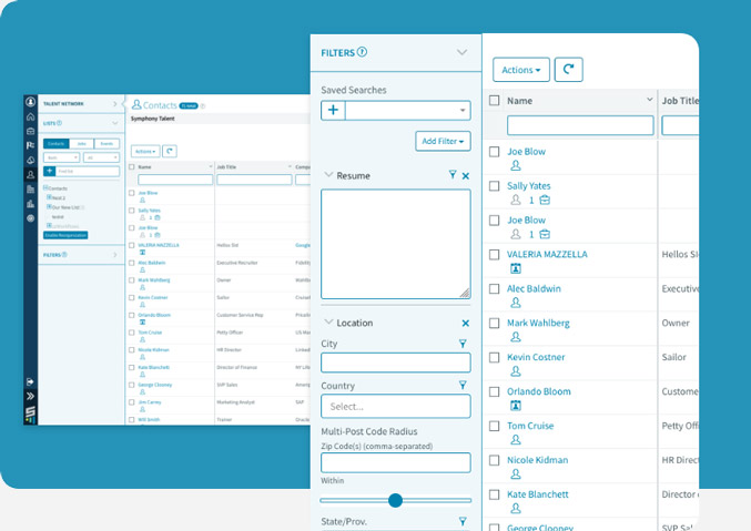

Sourcers focus on searching for specific types of candidates -relative to a job/requisition or role and are constantly using search - these guys stay in the ‘search’ tool and are very aggressive.

Recruiters focus on searching within a specific profile or contact record - unlike the Sources they use search quite regularly, but mostly when evaluating a specific candidate, or looking for a specific skill
We interviewed and spoke with several of our clients' users to understand their search habits and how they interacted with the tool. Instead of just asking about their experiences, we had them perform actual search queries and complete specific tasks.
Over the course of 11 user sessions, we observed an average of 4.2 steps taken before users found their intended result. Notably, 60% of users relied on filters after searching rather than before, and 35% struggled with unclear filter labels.
By tracking each step in real-time, we identified key friction points—such as 25% of users needing to refine their queries at least twice before getting relevant results. These insights helped us streamline the search experience, improve filter discoverability, and refine auto-suggestions to reduce unnecessary steps."
We started developing concepts by wire framing ideas based on the research, feedback and any other possible pain points from research as well as a heuristic analysis - keeping in mind the original problem of “filtering” and started looking at how this might effect the platform as a whole. Search would touch almost all corners of the product and we wanted to be sure we had a solid user experience across the product.
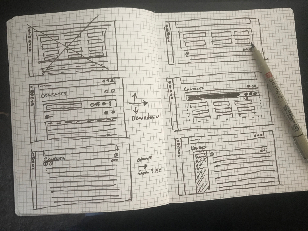
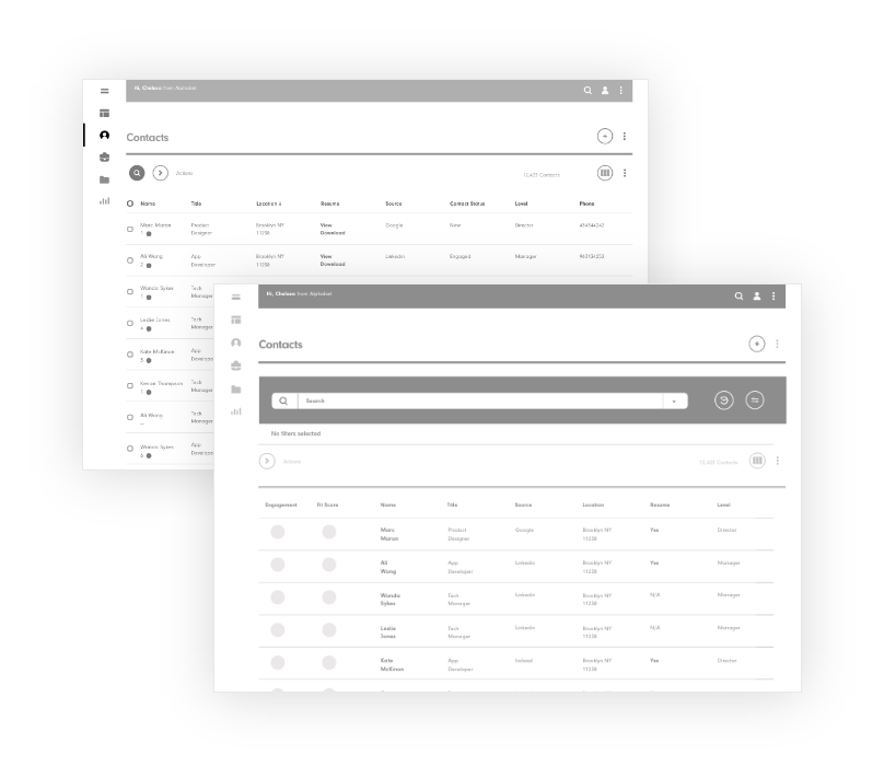
Based on the feedback and user data - I wireframed several concepts that take into account the usability mentioned through the pain points as well as the primary issue of filtering.
I decided that taking into account the current flow ‘the legacy’ platform, to some degree could be beneficial as long as it didn’t promote bad behavior through workarounds and other nuances that could arise as well as work to the users benefit. I wanted to give the user what they needed to accomplish the goals that are needed to be achieved on a daily basis through the tool of ‘search.
From the wireframes and based on research, I prototyped 2 concepts:
1 option takes into account the specific use of the tool by the users tested by
giving them what they need most, but still giving access to the options that were
rarely or less used. (progressive disclosure)
2nd option was based on the initial primary layout giving the users only the filters
most used based on the research, and giving access to the advanced search by triggering
a link/button for a vertical expanded view of the lesser used filtering options.
I can't say this design/feature was a success by any means. There were a-lot of challenges just getting back to users for testing. This is an issue that needs so much more effort and obviously theres still a bit of work to be done on this basic feature to get it right. I don't feel as though any of these are right and since this touches the whole platform, this effects both UI, IaX design and the over all experience.